The Interaction Design Foundation is publishing Gamification At Work by Jankaki Kumar and Mario Herger for the public tomorrow. I just finished reading the book and taking notes thinking I might review it. However, rather than do a simple review of the book’s content, I decided to situate the major points from the book into a post on the general topic of gamification in the workplace.
I appreciate the opportunity to read the book’s early release and, if you haven’t yet seen it just click on the link to it above and you can access it as well. Hopefully you will also consider reading my own thoughts on how the points in the book fit into what is most aptly considered gameful design.
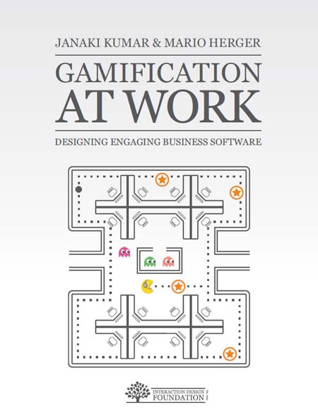
Gamification At Work is an interesting read for several reasons. Kumar and Herger not only cover the essential components of a well-thought approach to why playing games is not antithetical to getting work done. They add to that contribution by outlining a design strategy, which they refer to as Player Centered Design, and providing case-study insights from the SAP Community Network that add essential details to each part of their overall discussion.
One of my earlier posts discussed the learnability of a service as a key challenge for experience design. Today I ran across this early video from Don Norman on learnability and product design. I thought I would share it.
At the end of February I co-presented at STLUX’11 with Dave Gray. Our presentation was called Exploring the Usefulness of Chartjunk. The collaboration behind the presentation started as an exchange between the two of us on Twitter regarding whether the whole concept of Chartjunk is a myth. Over a series of conversations about recent research on the relative importance of visual embellishment in how people remember and understand data, I suggested to Dave that we develop a presentation around the topic. Dave agreed and suggested that we also build the presentation in a manner that engaged the audience to share their thinking about the issues involved.
Dave and I designed the presentation as a simulated debate between the pre-eminent critic of Chartjunk (actually the design theorist who formulated the concept) Edward Tufte and Nigel Holmes, an illustrator and the former Graphics Director at Time Magazine. Homes is well known for his use of visual embellishment in designing graphics that tell stories about data relationships. We designed the presentation around four graphic displays, two by Tufte and two by Holmes. We discussed the graphics and then asked members of the audience to consider each graphic on four dimensions.
ease of understanding what it is about
ease of understanding the categories and values displayed
ease of seeing the basic trend
ease of determining whether it conveys a message
I designed a simple survey that allowed us to gather data on those four dimensions using an implicit five point scale, eliciting participation and dialogue with the audience at the same time. The graphic below provides a view of the survey’s instructions. The participants seemed overall to enjoy the approach and the evaluations confirmed the impression.
We drew the four dimensions from research done in 2010 by members of the Interaction Lab at the University of Saskatchewan. The Interaction Lab researchers designed an experimental study to test two basic questions: “first, whether visual embellishments do in fact cause comprehension problems; and second, whether the embellishments may provide additional information that is valuable for the reader.” I’m not going to detail the methodology used, however the researchers asked four questions to participants in the research as they reviewed graphics by Holmes with a great deal of visual embellishment or the same graphics after applying the data-ink ratio used by Tufte.
Q1–Subject: ‘What is the chart is about?‘ ‘Tell me about the basic subject of the chart.’
Q2–Values: ‘What are the displayed categories and values?‘ ‘Tell me how the chart is organized and any relevant values.’
Q3–Trend: ‘What is the basic trend of the graph?‘ ‘Tell me whether the chart shows any changes and describe these changes.’ (Note that this question was not relevant for pie charts.)
Q4–Value Message: ‘Is the author trying to communicate some message through the chart?‘ ‘Is the author trying to get across a specific point or is he or she merely presenting objective information?’
We reported on the major findings of the research team to the audience as follows:
There was no significant difference between plain and image charts for interactive interpretation accuracy (i.e., when the charts were visible).
There was also no significant difference in recall accuracy after a five-minute gap.
After a long-term gap (2-3 weeks), recall of both the chart topic and the details (categories and trend) was significantly better for Holmes charts.
Participants saw value messages in the Holmes charts significantly more often than in the plain charts.
Participants found the Holmes charts more attractive, most enjoyed them, and found that they were easiest and fastest to remember.
At the end of the presentation, after we covered the research study findings, we then asked the participants to list as many of the graphics from the four discussed earlier and to rate each along the four dimensions. As we broke up the session a few participants asked if we could share the findings from the participative survey.
I agreed to post the results and I am now getting around to it.
Back in 2006 Hugh Macleod offered the following point on Gapingvoid: “If people like buying your product, it’s because its story helps fill in the narrative gaps in their own lives.” At the time I thought it conveyed nicely the point made by Gerald Zaltman in How Customers Think that “companies should define customer segments on the basis of similarities in their reasoning or thinking processes” (p. 152) rather than constructs related to demographics. Hugh’s point made a lot of sense when I first read it and the point continues to gain in significance for me.
Hugh’s initial post sparked a range of interesting comments that I encourage anyone puzzled by the quote to read. The one point I’ll make about the topic is that nowhere in the post or the comments does anyone say what they mean by narrative gaps. I’ll attempt to clarify the concept below because it doesn’t simply mean stories. Stories that fill narrative gaps do so by purposively or accidentally creating personal curiosity, imagination, intrigue, or mystery for people experiencing them.
Narrative gaps in our personal stories are resolved through other stories about our own experience, perhaps with a product or service, that help us make sense of the feelings evoked. Specifically, Hugh noted in a later post that people fill in narrative gaps with meanings they construct from their own stories. It is on this point that the concept of personas becomes relevant to narrative gaps and to a recent conception of how to use social media robots, especially DigiViduals™, in qualitative research. Moreover, in this respect I suggest that the challenges involved are analogous to key ones faced by industrial robotics.
Met Dave Gray, Andrew Simone, and Jim Durbin for coffee yesterday afternoon and thoroughly enjoyed the conversation over a range of topics. Dave’s approach to connecting visualization and explanation is always impressive. Andrew and I stayed around a while after the others left to talk about a range of things, but in particular his own interest in how we communicate what we know visually. The conversation led me to remember a Handbook from the mid-1990s that I worked through at one time called VizAbility, by Kristina Hooper Woolsey.
Upon entering my office at home I immediately pulled it out and popped in the CD to re-acquaint myself with a few of the exercises . I know a lot of books were written on visual design and communication over the past decade, but in my opinion VizAbility really stands out as both a classic and enduring resource of inspiration. It helped me through the visual design side of a couple of tough multimedia projects when I first read it in 1996. A short excerpt gives a good sense of its approach.
…for most of us, drawing is relegated either to our early school years or the hobbies of late adulthood, as if it were relevant on to the beginning and end of our lives. It is a skill that is approached lightly or not at all during the bulk of our education or professional activities.
But excluding people from the experience of drawing because they are not artistically “gifted” is like excluding people from speaking because they are not great orators or from writing because they are not first-class novelists. Drawing is not just a way to produce art, reserved for those talented in techniques and materials. It is a critial skill for bringing ideas into the world, and a tool for better learning and communication.
Anyone who doesn’t know the book ought to check it out. Now if I could just let that insight sink in again 😉
As part of an overall critique of self-oriented approaches to innovation, Skilful Minds first considered open innovation at Procter and Gamble back in 2006. The latter post is one of the most visited here.
Given my recent focus on transformation as a fundamental concern for those interested in design and innovation, the recent publicity about P&G’s Social Media Lab instantly drew me to take a look.
Dan Saffer’s recent book, Designing Gestural Interfaces, makes you think anew about the hand dryers and faucets in public restrooms that respond to waving hands. In fact, Dan notes that gestural interfaces are currently found in specialized products paired to specialized activities in specialized environments. As he observes,
Public restrooms are currently a great example of this, but other spaces could easily take on this sort of “hothouse” environment. The next likely place for such experimentation is kitchens: they feature lots of activities, plus a contained environment with tons of specialized equipment (pp. 160-161)
Designing Gestural Interfaces is the first attempt I’ve seen to provide an in-depth discussion of the challenges in designing devices that people control through gesturing. Although it isn’t the central point of the book, Dan discusses restroom interfaces that wet hands, dry hands, flush toilets, and dispense SaniSeats. And one of his example photographs is notated, “Apparently, public restrooms are excellent places to find gestural interfaces.”
I just finished reading David Bramston’s new book, Basics Product Design: idea searching. First, I highly recommend the book, both for its writing and the visualizations of product ideas offered in it. The design of the book itself is as striking as the product designs it discusses and shows.
Given my recent posts on the importance of metaphorical understanding in the design of ubiquitous computing devices as well as design research more generally, Bramston’s distinction between literal thinking and lateral thinking in product design caught my attention.
Lateral thinking is a capacity to address conventional thoughts and assumptions related to a particular problem from a different or unorthodox angle…A literal approach to design still requires an imaginative approach, but tends to concentrate on more obvious aspects – a direct interpretation of meaning….In generating ideas for a design it is worthwhile exploring both aspects of literal and lateral thought patterns and, where possible, to instigate a hybrid approach of the thinking methods.
In recent posts I discussed different gaps, from thecommunity gapin particular to the encompassing engagement gap. Each of those discussions attempted to size up a disparity between the attention currently given to the importance of community and social media by companies and the reality of the commitment of resources to them based on recent research in the United States and Europe.
We hear a lot of discussion these days about Web 2.0 and social media, especially on whether adoption is driven by demographics, lifestyle, or something else. Recently, while reading Marketing Metaphoria by Gerald Zaltman and Lindsay Zaltman, it struck me that regardless of the patterns of Web 2.0 and social media adoption, the applications tap into basic sensibilities for connection that we all share, regardless of age and lifestyle. As I note below, a sense of connection is an example of a deep metaphor that the Zaltmans discuss in relation to people, products, and brands.
Deep metaphors underlie the way people understand the context of problems they face in their everyday lives. Though the concept of deep metaphor was initially outlined in Lakoff and Johnson’s book Metaphors We Live By, Marketing Metaphoria takes it a step further by developing useful techniques for exploring how deep metaphors affect the perception of brands and products and, by implication, how to approach the say-mean gap in design research.
I received an email alert from the Contintental Automated Building Association’s (CABA) Connected Home Research Council indicating it is initiating a new project on the Connected Home User Interface. Our last post discussed these issues in the relation to Whirlpool’s CentralPark Connection and questioned designs that depend on a single user interface to “intelligent” appliances and, by implication, homes. CABA’s Connected Home Research Council’s research agenda on the Connected Home User Interface characterizes the issues in the following manner.
The evolution of the digital home lifestyle has been, in part, created by consumer demands that are driving tremendous industry change and opportunity. The connected home offers various promises to simplify interaction and engagement of consumers with family, entertainment, career and home system solutions
Two of the open questions that have yet to be answered is (1): How do product developers and managed solution/service providers best aggregate data into potentially, one single user interface that is both intuitive and adds value to the holistic connected home? And (2): How does the user interface solution support the delivery of the digital lifestyle promise?
CABA’s Connected Home Research Council (CH-RC) is sponsoring a consumer research study that will define the specific attributes or baseline criteria of a ‘connected home user interface’ for consumers when managing the connected home.
Current Steering Committee members seek answers to some of the following questions:
What type of information and/or control do consumers really want (passive versus interactive data)?
What type of access, convergence of services and data set to home service content is desired?
How can the whole home solution enhance the digital lifestyle?
What do you think about the questions posed by the Connected Home User Interface project?
I’ve been meaning to write about Dan Saffer’s Masters Thesis since reading it a couple of years ago. A recent post by Mike Kuniavsky provides an opportunity to do so. Also, it appears that Dan left his position at Adaptive Path to found Kicker Studio, a product design company. In The Role of Metaphor in Interaction Design, Dan noted that metaphors help users/customers understand new products and services by providing cues that orient and personify the experience of the familiar with the new.
In other words, metaphors help us understand one thing in terms of another by highlighting similarities between the two, while at the same time implicitly recognizing differences. Dan also added that metaphors introduced to facilitate adoption of a new product can also limit its innovation in other ways. He specifically pointed to the Workspace is a Desktop metaphor, which conceptualizes the computer as an office tool primarily. I would add that the metaphor contributed to the myth of the paperless office by obscuring the differences between desktops and graphical user interfaces. Specifically, Dan contended that,
it could be argued that the desktop metaphor has hindered the development of ubiquitous computing as much as some hardware factors (p.22).
At the same time, he observed that the desktop metaphor was much more effective in gaining the widespread adoption of computers when compared to the previous metaphor, i.e. computers as programming environments. He recommended that whenever designers use a metaphor in a new product they need to begin with what is new, the subject of the metaphor, rather than what the metaphor refers to. In other words, don’t force functionality into a metaphor. Use the metaphor to support a concept rather than the other way around. The point builds on the design principle of Cooper, Reiman, and Cronin in About Face 3.0 to, “Never bend your interface to fit a metaphor” (p. 279).
Keeping up with social media is a real challenge these days. However, one theme seems constant whenever you read blogs about social media, especially among marketers and so-called optimizers who target, target, target to drive, drive, drive customers to their client’s social media asset, i.e. video, blog, community, etc. You would think advocates of social media are Rowdy, Gil, Jed, or one of the other actors on Rawhide.
I don’t usually discuss books or reports without contextualizing the discussion. However, I’ve just begun reading a book that merits mention before digesting how it fits either strategically or tactically with experience design issues.
Skilful Minds first discussed virtual anthropology several years ago noting the following.
The term points to the ability of customer researchers to now tap into the stories about personal experience that increasing numbers of people are providing online…But, keep in mind that the people offering their stories and experiences for your edification are not doing it for you.
We initially discussed place-based stories back in 2006, noting the way [murmur] provided people experiencing a place to add a story about their engagement with it. To listen to the stories, visitors to that place simply called a number on their mobile device.
I was reminded of the [murmur] service this past weekend while walking through the Missouri Botanical Gardens(MoBot) here in St. Louis. MoBot is hosting the Niki exhibit, showing forty mosaic sculptures done by Niki de Saint Phalle (1930 – 2002). Each sculpture is assigned a unique number that corresponds to an audio message for that work. For example, La Cabeza information is available at (314) 558-4357 11#. Read the rest of this entry »
I ran across the following video illustration of the design process from Johnnie Moore’s blog. It points to several issues in the creative and research side of design and innovation with a humorous touch. Enjoy…
Although the video makes its points through a degree of exaggeration, the history of the stop sign in the United States does reflect some of the uncertainties depicted.
Adam Silver, a Strategist at Frog Design, recently wrote an insightful article, “Calculated Design”, in the company’s online magazine — design mind. I want to discuss the article because it touches on several key issues relating to innovation and designing products and services for the experience of users/customers. Adam notes that as globalization and digitalization emerged in the 1990s the trend resulted in product and service interfaces with more culturally diverse and geographically distributed audiences and a fragmented market. The combination of these forces led designers to search for new methods to augment artistic intuition. Considerations of form and function also required attention to feel, features, and interactivity attuned to the needs, wants, and beliefs of specific users/customers.
As Adam observes, ethnography was one of the first new methods incorporated by design research to meet these challenges in the market. However, he thinks ethnography is, on its own, unable to provide the kind of information needed to validate product and service ideas across wide audiences. Read the rest of this entry »
Tom Stewart indicates that the International Standards Organization (ISO) recently “decided to use the term user experience in the new version of ISO 13407 (which will be called ISO 9241-210 to bring it into line with other usability standards).” He is in a position to know, since Tom serves as Chair of the sub-committee of ISO responsible for the revision of ISO 13407 – the International Standard for Human Centred Design. The change might not seem significant at first glance, but its importance is easy to miss. Read the rest of this entry »
Back in January 2006, in a discussion of Peter Morville’s Findability, we noted two innovative approaches to using the built-in digital cameras of mobile devices, like cell phones, to input URLs for locating web sites to retrieve information using offline visual tags. Specifically, we noted,
Shotcode and Semacode make mobile information seeking over the web work like scanning a bar code to determine the price of an item. They make offline media interactive. It is pure pull, unless you consider the offline advertising “pushy”. The metadata necessary for accessing relevant information is largely in the context, the embodied situation of the user. Consider the experience of walking down the sidewalk past a bus stop with large sign displays for a musical artist. You see the artist, you read the title to their new CD, pull out your mobile phone, and take a picture of a symbol on the sign to call up a rich media advertisement, or informational message, on the artist.
H&M has recently taken the technique to the next step in Europe. Impulse shoppers can use their cell phone to snap a picuture of a semocode associated with a product, pull up a catalogue and make the purchase by charging the item to their cell phone bill. The semacodes are used on posters and in magazine advertisements so the buyer does not need to provide information to the seller, in this case H&M.
Skilful Minds first discussed feature bloat in mobile devices here. We have mentioned OpenMoko as a potential solution to experience design issues related to users controlling the seams of mobile devices as well as providing vertical applications to better fit user needs. Well, OpenMoko has finally been opened up to the public so that we can follow the process of developing and implementing innovative sofware on an open source mobile device. OpenMoko is based on the Linux kernel and, unlike other mobile devices using Linux, the applications for OpenMoko are open source.
You can see a video interview with Shawn Moss-Pultz . He is the product manager for First International Computer’s Mobile Communications group which produces the Neo 1973 phone, the initial hardware platform for OpenMoko. In OpenMoko the entire software stack is open to developers to come up with innovative applications.
I know, I know, you are probably saying “Can’t he talk about anything but seamful and seamless design?” Well, I’ll get off that topic soon. Yet, in the meantime, here are a couple of examples of how a seamless interface to the user of a device is a seam for control by someone else. One basic point of those arguing for seamful design is that the user of the device, rather than the developer, is the agent whose control over the device needs maximizing by designers. Those who contend the goal of a seamless interface is a well-intentioned effort to relieve those using ubiquitous mobile devices from information overload often fail to mention up front that all connected devices provide seams of control. You might say that proponents of seamful design are the Libertarians of experience design, contending that control over the agency of any device belongs with the person who uses it, especially if they own it. Read the rest of this entry »
You are currently browsing the archives for the User Experience category.
Skilful Minds discusses Experience Design
and the ways it matters to client stakeholders, whether users, consumers, customers, learners, or just plain people.


 Posted by Larry Irons

 Met
Met 


 I received an email alert from the
 Keeping up with social media is a real challenge these days. However, one theme seems constant whenever you read blogs about social media, especially among marketers and so-called optimizers who target, target, target to drive, drive, drive customers to their client’s social media asset, i.e. video, blog, community, etc. You would think advocates of social media are Rowdy, Gil, Jed, or one of the other actors on